Unit 4:Project Design Implementation and Evaluation - Week 24/25
These have been the last two weeks of project development. Unfortunately, I have not made as much progress as I wished, due to other assignments. Regardless here is what I did do:
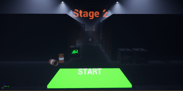 Stage 2 is similar to Stage 1, in the sense that it's very versatile in the way that it plays out and the routes you can take. It does a better job at pointing the player in a certain direction, while still allowing them to go in a different path. It's like the perfect in between of linear and versatile.

 Almost every room has different characteristics, with exception of the last two smaller ones. Generally the player will be moving differently and using different methods of killing the targets, based on the room.
This level has also been designed in a way that compliments the movement mechanics, as you are about to see in the next two images.

 In the first image, you can see the first choice that the player has, at the very start of the stage - you can go left, having to crouch which obviously slows you down quite a bit; You can go right, having to jump which does not slow you down, however the path and how the enemies are positioned will slow you down for sure; OR you can jump on the ledge and jump up on the other ledge in front of the player, which takes you in an alternate path, making the route very awkward, but not necessarily bad.
In the words of Thanos himself, "Perfectly balanced, as all things should be".
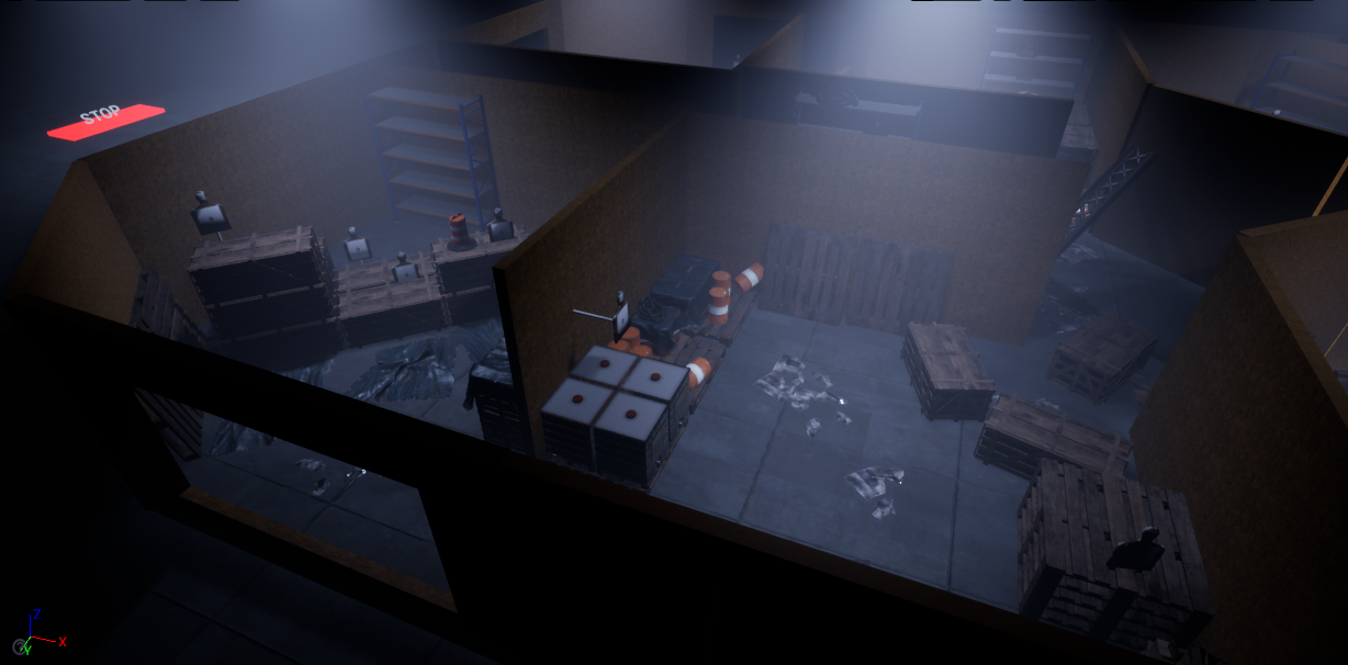
In the second image, from this angle you have to crouch in order to get to the other side which will slow you down, however from the other side you can jump over the box, which is much faster.
 Lastly, in this level there is also a concealed enemy, hiding in the shadows. This will most likely catch players off guard, and you will also likely forget about him even after a few runs.
Now Stage 3.


 Similar to the second level, there is another hidden enemy, however this one is harder to kill since it is located at the back of a long hallway. The player has to chose how to kill this enemy: either by using the assault riffle and risk missing shots and wasting time; by using a shotgun for which they would have to get closer and waste time; OR by wasting one of the two grenades that the player has.
 Lastly, there is also moving AI in the level. Unfortunately it doesn't provide much towards the gameplay aspect. This is because when I first implemented it, I still had plans of making more levels, with more complex moving AI.

 There is a navmesh bounds box, and inside there are two target points, where the AI navigates in between. There is also the code, which is quite simple and self-explanatory - essentially, after a delay the AI moves from the current target point to the other.
Now in regards to the Main menu and loading screen.
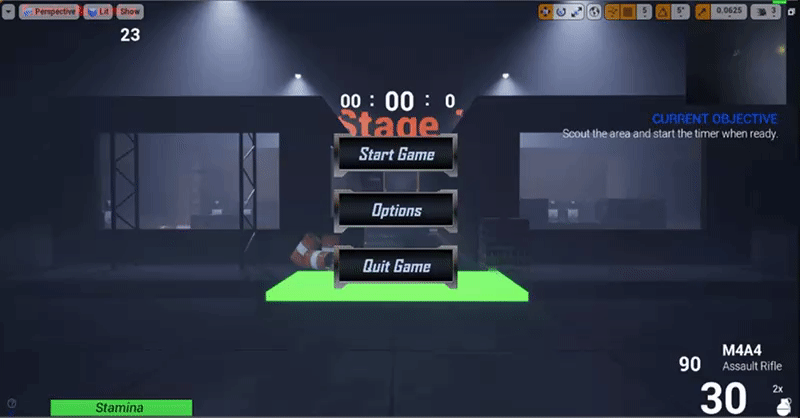
This is what the main menu looks like:
 Unfortunately, there aren't many options in it. This is because I ran out of time.
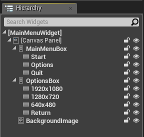
 For instance, here you can see some of the other buttons that I made, which didn't make it into the menu.


This is how the buttons are laid out. Essentially two vertical boxes guarding the buttons, one with the three main choices, and the other one which only appears after you click the 'Options' button.
 This is what each button exactly does. They essentially run pre-made commands within the engine. Pretty self-explanatory.
Lastly, the loading screen.

- Added two more levels;
- Added moving AI to on of the levels;
- Added a main menu;
- Added a loading screen.
First off the levels. As mentioned in previous posts, I wanted to add more levels - at least 2 more to get a total of 3, but preferably 4 to have a total of 5.
Sadly I did not have enough time to add that many, and since I believe that quality is far more important than quantity, I decided to make the two added levels the best the could be, by giving them different styles in their gameplay design (more on that later).
Let's start with Stage 2.


In the words of Thanos himself, "Perfectly balanced, as all things should be".
In the second image, from this angle you have to crouch in order to get to the other side which will slow you down, however from the other side you can jump over the box, which is much faster.

Now Stage 3.

I tried making Stage 3 different from the other two. Instead of versatile, Stage 3 is way more linear. For instance, there is only one way into the course. Also, instead of having multiple pathways and entrances to rooms and vicinities, the stage is more straightforward. Having said that, there are still a couple choices and changes that the player can make towards their route.


As you can see, the contents of each room also differ from other levels, in the sense that enemies are more in terms of quantity and are also more concentrated and put together. This allows for better use of the grenade launcher.


Now in regards to the Main menu and loading screen.
This is what the main menu looks like:


This is how the buttons are laid out. Essentially two vertical boxes guarding the buttons, one with the three main choices, and the other one which only appears after you click the 'Options' button.

Lastly, the loading screen.
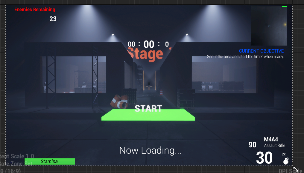
Very simple image with some text at the bottom. This is displayed whenever the player is transitioning into the next level.
Concluding, this is the end of the development journey. It wasn't mentioned above, but some constraints were found along the way, like any programming journey. While I did cover them briefly along the blog posts, I will go over them again in the final post.
As a matter of fact, I will go over everything again in the final post, reflect on the whole journey, critically evaluate my work, and think about what could I have done differently and what could be improved.

Comments
Post a Comment